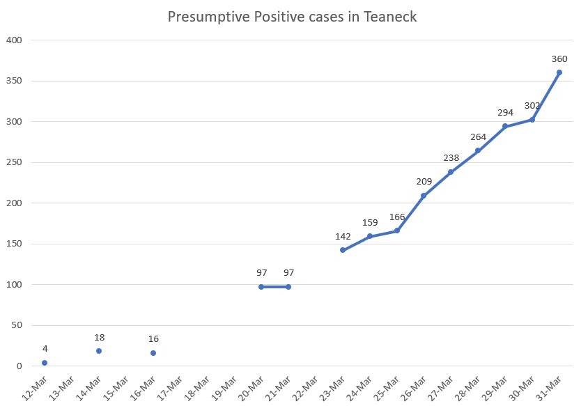
First caveat: I created the first chart (based on numbers I received from the manager), so errors are possible despite my efforts to be accurate.
Second caveat: we do not have good data sets because testing is not yet available for widespread use. The charts below are based on those tested after showing symptoms.
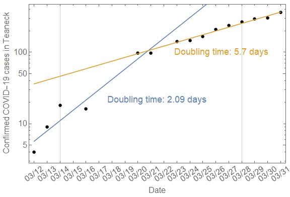
The data below are the same in each chart.
The first chart shows the number of cases reported as presumptive positive in Teaneck. Despite all of our efforts, cases will continue to rise.
But — the second chart shows the rate at which those presumptive positives are doubling. The second chart is on a “log vertical scale”, which provides equal intervals for doubling effects (i.e. the space between 5 to 10 is equal to the space between 50 to 100). The second chart also contains two exponential fits for the data sets.
What the graph shows
They started to double within a predicted time-frame of 2.09 days. That appears to have slowed to 5.7 days (thus far) through self-isolation measures.
Teaneck’s Mayor Mohammed Hameeduddin called for self isolating ourselves on March 14th. Look at what started to happen on the chart between 3/14 and 3/21.
Bottom line: Self isolation and washing our hands WORKS.
This will provide our healthcare system time to #FlattenTheCurve…. but only if we keep it up.